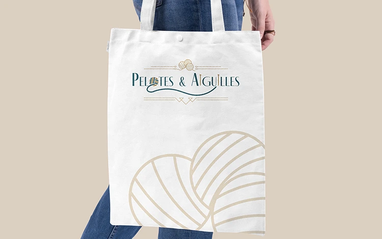
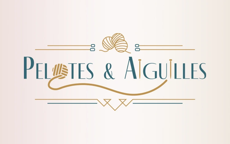
Logotype design & partial visual identity.
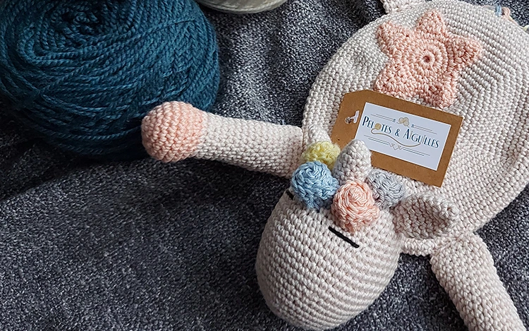
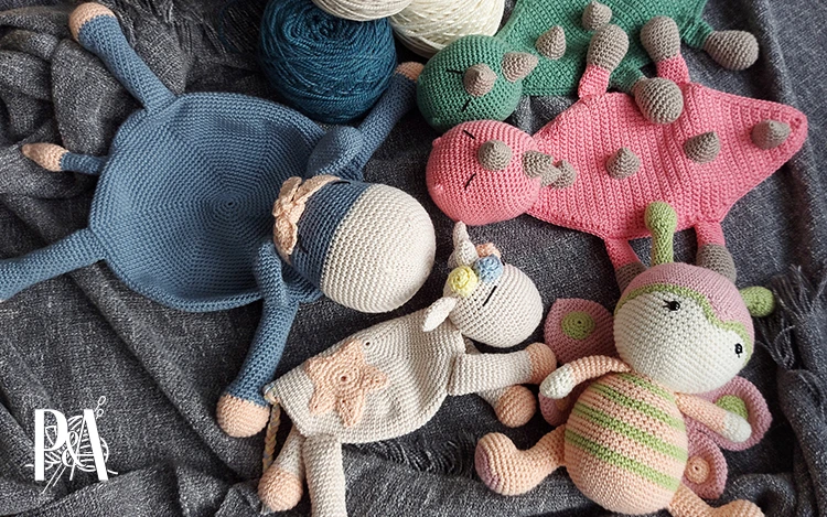
Hardworking and passionate, Silvia has been knitting for almost as long as she can remember.
Determinated to bring some changes in her life, she decided to take that passion of hers and turn it into a business.
Her weapons? A ball of yarn and some needles with which she makes the cutest amiugurmis and some very nice scarves!
Building her brand from scratch, Silvia reached out to me to discuss the creation of a visual identity for her newly launched company.
The logo had to :
On a budget, we agreed to focus primarily on the logo and a few elements such as a colour palette.
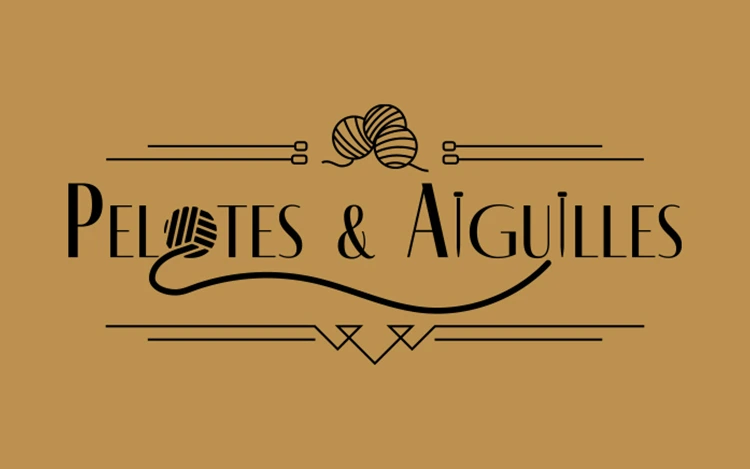
After some extensive researches, I settled on 2 primary colours: duck blue as requested and a complimentary golden hue.
The logo is a word-symbol made of an “Art Déco” influenced font and surrounded by “Art Déco” inspired décors representing a ball of yarn, knitting needles and a thread. The “O” and “I”s in the word-symbol were also replaced by these objects in a flat icon style.
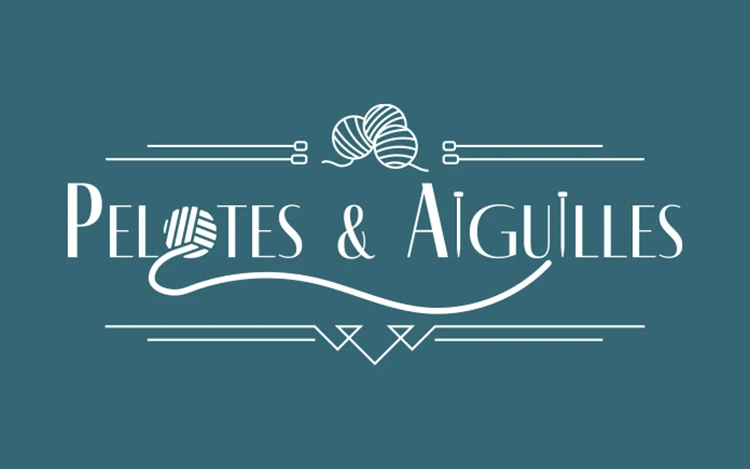
Monochromatic version black and white
Design progression for the balls of yarn icon