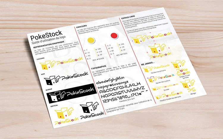
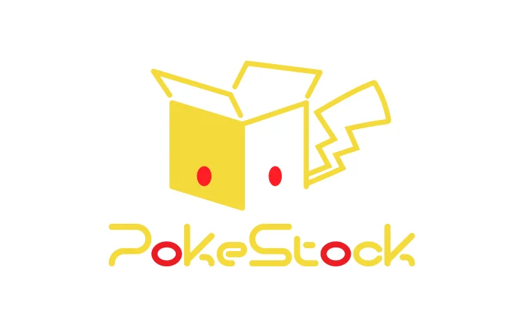
Logotype design.
Cyril has been a Pokemon trading cards enthusiast for the last 20+ years.
Confronted with a lack of options to buy accessories to store his precious cards, he decided to take the matter into his own hands and launched PokeStock.
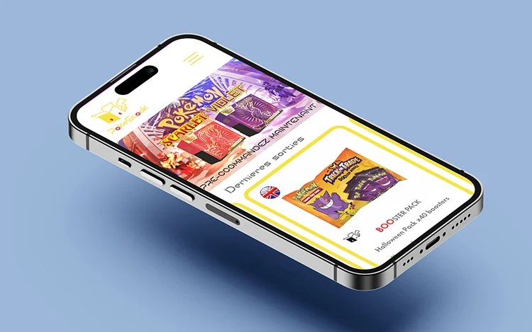
Primarily focused on card sleeves, boxes, display and pretty much anything a card collector would need to take care of their collection, he expanded his offering to various Pokemon-related product and, of course, the precious trading cards themselves!
As his side-business was growing, Cyril figured that he should move away from his quickly-made Pokemon-knock off logo into his own, personalized brand.
His main criteria were as follow:
While the first idea that comes to mind when thinking “Pokemon” and “Storage” is a Pokeball, Cyril made it quite clear: he didn’t want that.
I decided to focus on storage company and got inspired by the imagery they were using rather than looking at the Pokemon side.
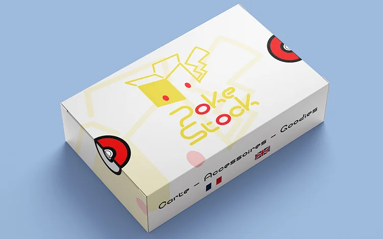
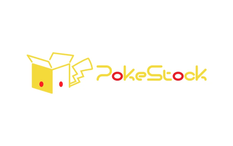
The box quickly became an obvious choice. I could picture it mixed with attributes from Pikachu (the lightning-shaped tail, yellow fur and red dots). I chose to flat-color one side to add some dimension to the overall design while keeping its simplicity.
Because the Pokemon typography is so recognizable and licensed, I built a custom font for Cyril which he can now use anywhere he needs to!
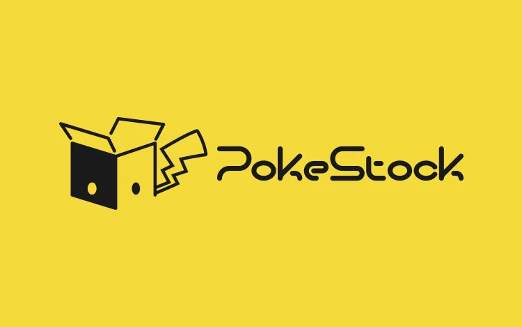
Monochromatic version black and white
Design progression for the icon